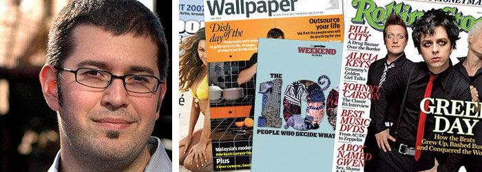
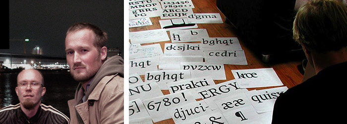
Thanks to friend Bonnie Tomek, I was introduced to the this incredible and interesting artist. Enjoy.
Thanks to friend Bonnie Tomek, I was introduced to the this incredible and interesting artist. Enjoy.
Yes, it was that time of the year again, and I made it to the Macworld 2011 Expo here in San Francisco, albeit the very last day. I have yet to attend any of the conferences. Here are my thoughts and highlights of the Expo. My compatriots were Cherie Carter and Jeanne Hendrickson. And I also ran into Adam Helweh, and photographer extraordinaire, Duane Conliffe.
I was very pleased to see the new inventors space (can’t remember the actual title) where I met two men who created a collapsible, pocket-size stand for the iPhone and iPad using Kickstarter to raise venture capital to develop the product and get it to market. I thought this was pretty cool. The interactive tables and whiteboards by SMART, Inc. were interesting.

Another highlight, was meeting these four entrepreneurs who have created “Off the Chain,” for iPods, IPads, iPhones, mobile phones, and mp3 players. They were incredibly enthusiastic and working the expo floor quite well. You can check them out at: http://digitaltrendsetters.com.
I also found a great productivity mobile app (for iPhone/iPod and IPad) made by Appigo, and a great remote clone tool made by thinkoptics, inc. I liked the thinkoptics, inc. app so well, that I’m finally going to update to the latest iPod Touch, so I can use it. I’m also purchasing MacKeeper a tool that has a great security feature in the event a computer is stolen. The Mac Geek Gab featuring Dave Hamilton and John Braun from The Mac Observer, Inc. was enjoyable and informative. It was good to see BusyMac who makes BusyCal as well, and I’m sorry I missed the OmniGroup booth. I didn’t see them. They make that great tool Omngraffle.
Although I did find these great products, talks and services, I will say that this year was a disappointment in that there were no products I could find that addressed my core interests as a Macintosh computer user in the areas of graphic design and photography on the Macintosh platform. Most vendors offered tools for the mobile platform. The fact that Macworld is having a mobile app conference and expo in Barcelona this year leaves me asking why did they dedicate 95% of the expo to mobile app developers. Hewlett Packard, Xerox, Seagate were the only prominent vendors here this year. It would be great if Adobe, Quark (yes Quark), and Apple saw we who use their hardware and software as a valuable consumer market. By the looks of this year’s Macworld, it is quite clear that this is not the case. See my addendum below.
It also seems that the focus of Macworld is only on the conferences and the expo is an afterthought. I think I’m finally at the point where I am seriously looking at not attending next year. I don’t do the conferences, as they are quite pricey.
Feeling a bit sad about the direction Macworld is taking. Maybe I’m too old-school. I miss the Geekdom of the Macworld of yore. Love to know your thoughts.
Addendum:
Just finished having a nice talk with my neighbor David Morgenstern, a blogger at The Apple Core on ZDnet and definitely one of my go to people for anything Apple, and he shared his thoughts about how many vendors who would like to show at Macworld could not do so due to the high cost of the exhibitors price. He also felt that companies like Adobe could not justify the cost in regard to their ROI (Return on Investment). Maybe Macworld needs to look at lowering its exhibitor’s fee or move the event to less costly venue. I think his point is well taken, and I thank him for sharing it.
Again, love to know your thoughts.
These are a few examples of some great work done by my Summer 2009 Design 1 students. The exercise was to typographically illustrate their assigned word using only black and white.
I am using this post as an illustration to my Social Media for Professionals class on how to link one’s blog to Flickr and embed a slideshow from there.
Full article here: With Eyes on World Expansion, Starbucks Drops Its Name From New Logo | Co.Design.
And a message from Starbucks. via erik spierkermann.
In this era of digital communication, one has to question whether revamping the U.S. Postal Service’s brand is enough. I think the designs Chase proposes are quite good, but are addressing the problems the postal services is dealing with that not only concern the prolific use of digital forms of communication that many of us are using, but also the many internal issues the service is dealing with, the most important being the laying off of employees due to a diminishing budget. What do you think? The full article with all design explorations can be read here: The U.S. Postal Service Is Dying. Why Not Radically Rebrand It? | Co.Design.
Nice article: great designers, good insight and inspiration. Where are the women and designers of color who, too are designing great fonts?


Read full article here: The faces behind the fonts: idsgn (a design blog).
I wouldn’t expect anything less creative from such a eclectic designer.
Read full article here: Imprint-The Online Community for Graphic Designers | Live From New York, It’s. . ..
It was wonderful to see the outpouring of concern over the Gap’s brand redesign and the impact it had in ultimately getting the company to back away from the poorly designed new mark, and ultimately, it seems the practice of crowd-sourcing. (Please see link at the bottom of this post for the article concerning this.)
I do feel a bit sad though, that while the Gap has publicly stated that they would not out source the design work again, and that this event has given many companies pause to think before engaging in this practice, the value that designers and design bring has been greatly compromised. Much of the dialogue missed a lot of the salient points that apply to design and the process. Is this because of the “instant information” culture in which we are living? Is it because we are in an economic depression? I don’t know. I see a lack of trying to understand the design process, or maybe even a resistance to doing the work entailed in developing the process, in more and more students.
How do designers sell the value of design in these times? Love to know your thoughts.
Gap Bows to Outcry – Nixes New Logo and #Crowdsourcing – http://bit.ly/cdb5xg
Tom’s of Maine new logo:
In my last post, I added the newly designed Tom’s of Maine logo and packaging to the discussion of poorly designed branding speared by the newly designed GAP logo.
In both cases, I sincerely feel the design process, and strategic design have completely been left out of the equation in the development of these brands. What is going on? As a design educator I find what I see as becoming a trend exemplified by these two examples quite disconcerting.
During project critiques, the design process that looks at the targeted audience and what it has already bought into in respect to a company’s brand and product or service, is always at the forefront of the design choices of color, typography, imagery, layout, etc. I just don’t see this consideration given in the case of the Tom’s of Maine and GAP redesigns.
What am I missing? Love to know your thoughts.
Graham Smith of ImJustCreative offers a nice perspective on the outcry about the GAP logo redesign. In his post, The Gap Logo – Is the outcry and criticism justified. In his followup post, The GAP Logo Design Revisited, he, in good fun, offers his reworking of the logo.
New GAP Logo
