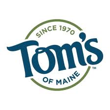
Tom’s of Maine new logo:
In my last post, I added the newly designed Tom’s of Maine logo and packaging to the discussion of poorly designed branding speared by the newly designed GAP logo.
In both cases, I sincerely feel the design process, and strategic design have completely been left out of the equation in the development of these brands. What is going on? As a design educator I find what I see as becoming a trend exemplified by these two examples quite disconcerting.
During project critiques, the design process that looks at the targeted audience and what it has already bought into in respect to a company’s brand and product or service, is always at the forefront of the design choices of color, typography, imagery, layout, etc. I just don’t see this consideration given in the case of the Tom’s of Maine and GAP redesigns.
What am I missing? Love to know your thoughts.
Graham Smith of ImJustCreative offers a nice perspective on the outcry about the GAP logo redesign. In his post, The Gap Logo – Is the outcry and criticism justified. In his followup post, The GAP Logo Design Revisited, he, in good fun, offers his reworking of the logo.
New GAP Logo


2 Comments